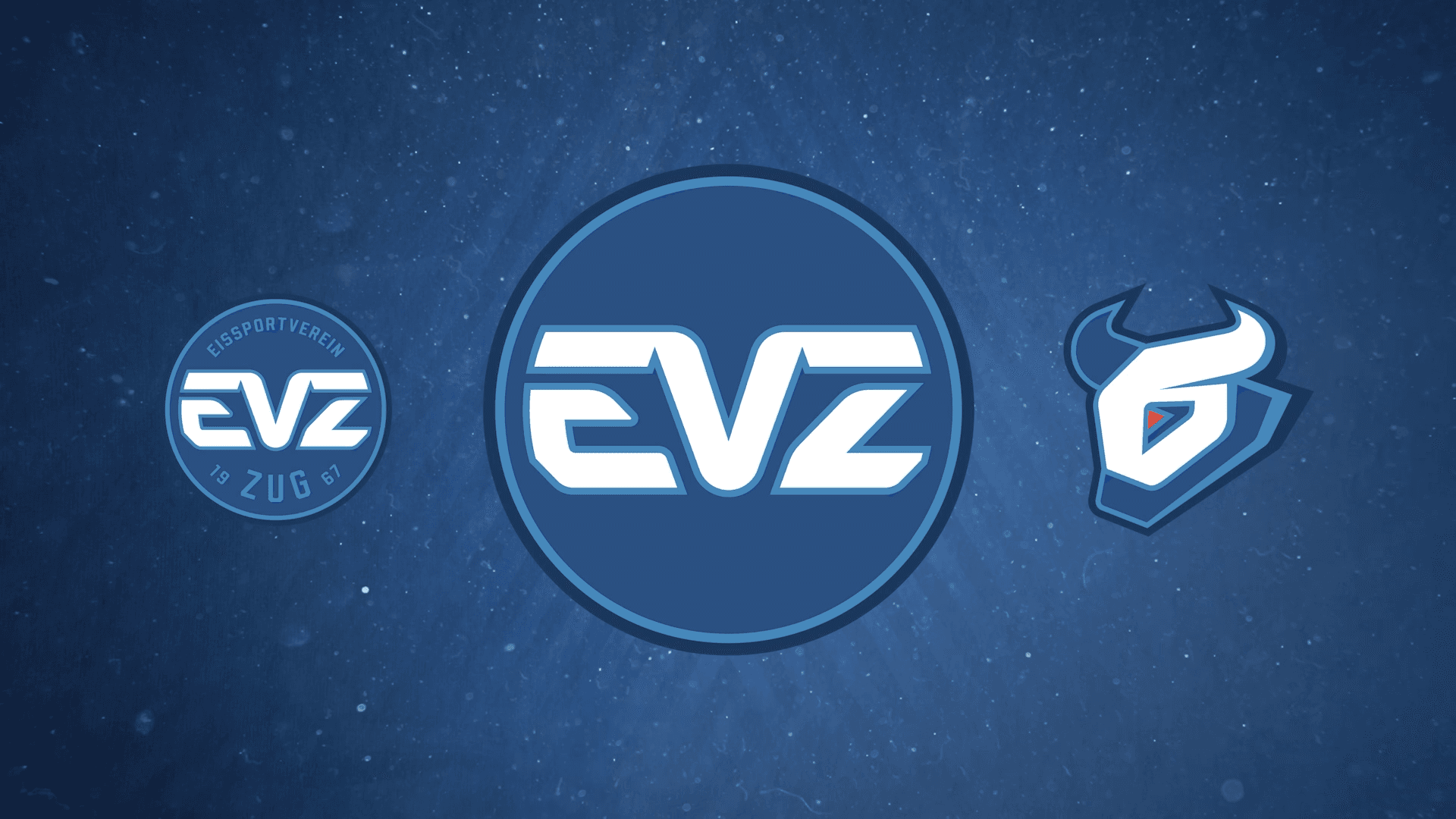
EVZ unveiled its new logo today during the National League home game against HC Ambrì-Piotta. A moment that marks an important step into the future for the entire club, the region and the EVZ family.
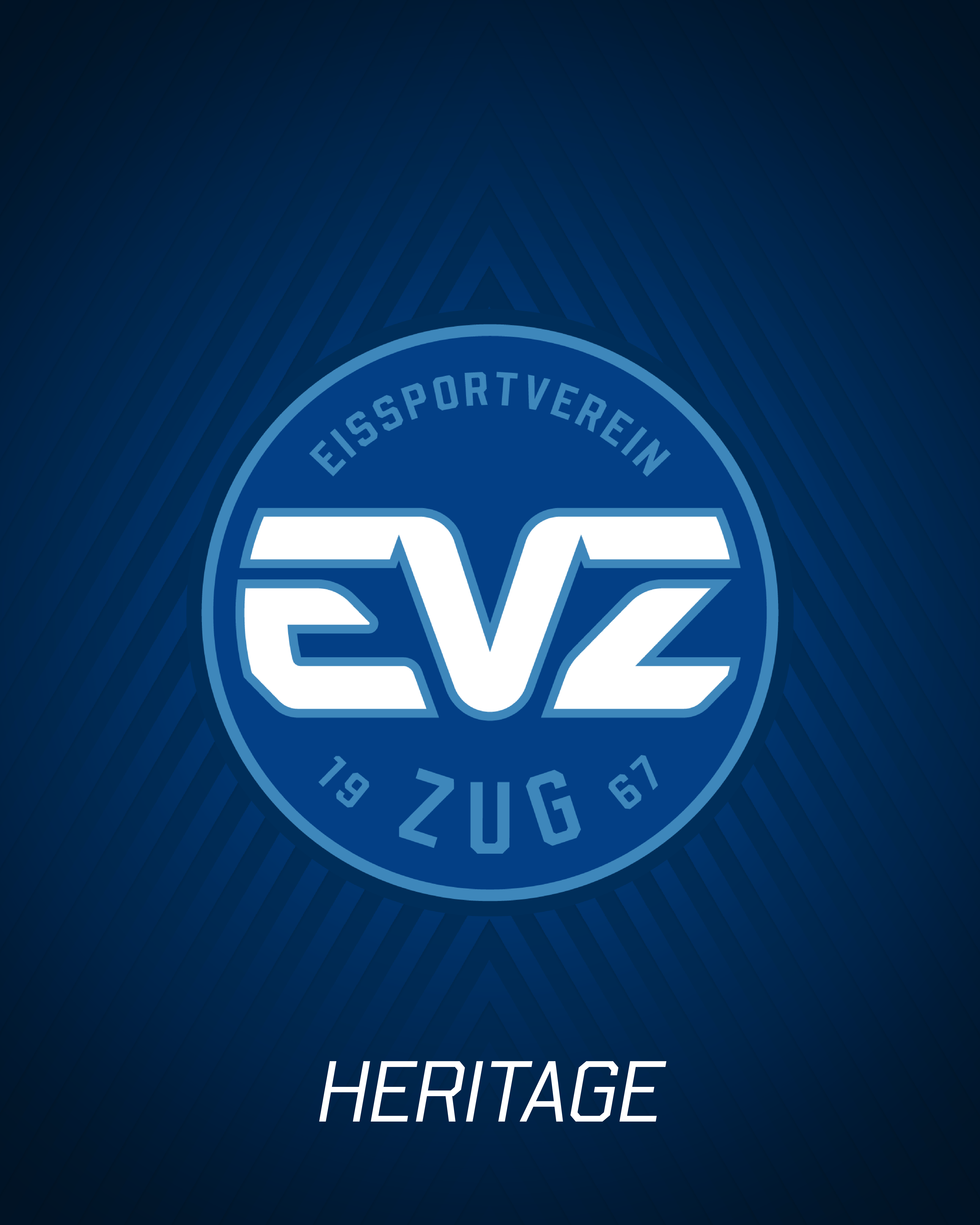
EVZ presents its new brand from the 2026/27 season – a strong symbol of origin, identity and future.
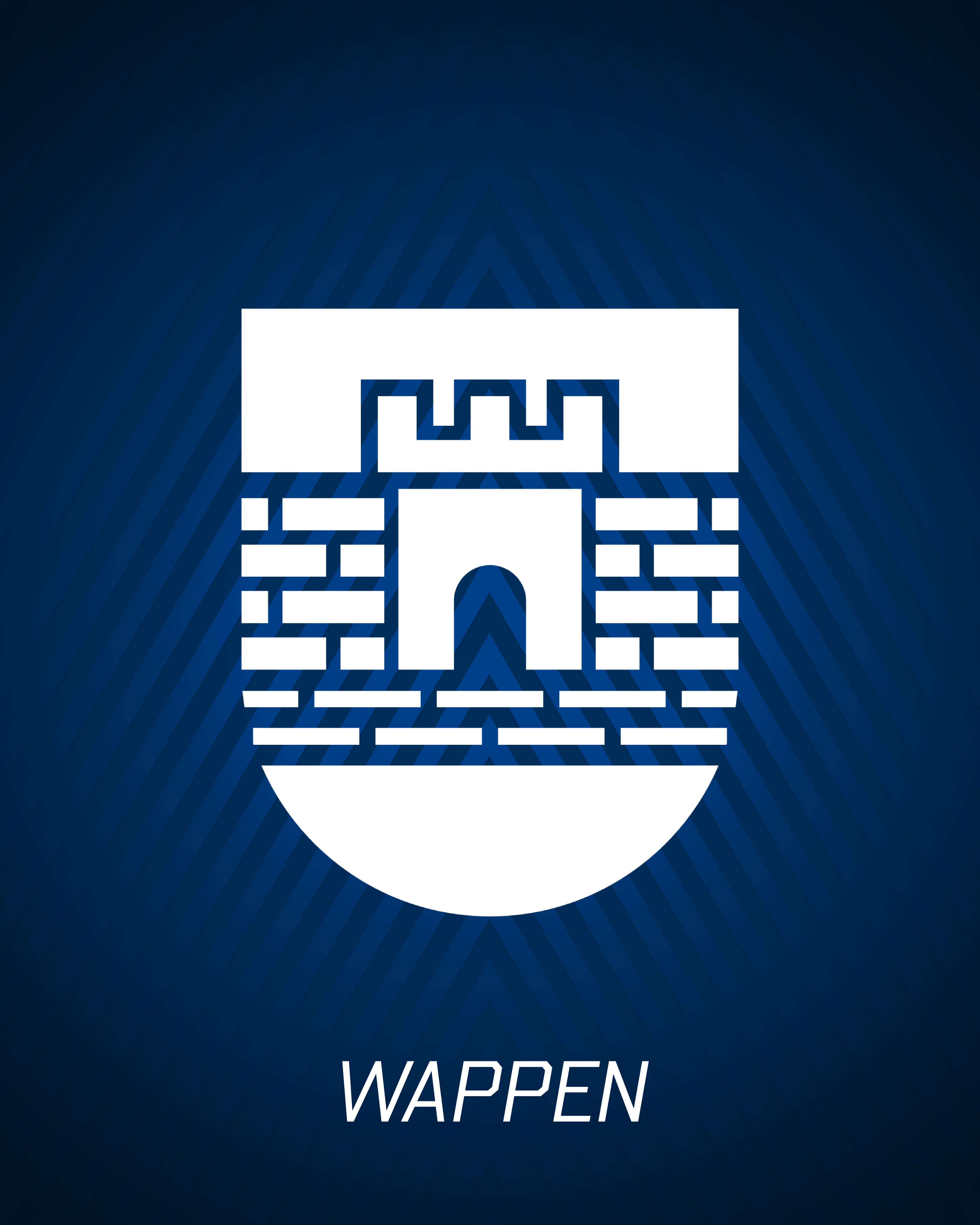
The new image is consistently in the club colours blue and white and thus focuses on the identity that has characterised the EVZ since 1967. The colours stand for continuity, recognition and a strong connection to the city and region of Zug. During the rebranding process, it was clear that the new logo should preserve the club’s roots while paving the way for the future. Reflection and further development go hand in hand – “Remembering where we come from, but still moving forward” was a central leitmotif.
Over the past few months, an internal working group has worked intensively with an external agency on the further development of the EVZ brand. The dialogue with our environment was particularly important: the voices of our fans, employees, patrons, sponsors and partners – in other words, all of our key stakeholder groups – were actively included in the process and listened to in a targeted manner.
At the centre of the new logo are the colours blue and white and the three letters:
- E for ice sports
- V for Verein – the element that combines sport and the city.
- Z for Zug
The V forms the bridge between E and Z in the new logo. It symbolises what has made the EVZ strong for decades: community, cohesion and the togetherness of people, the city and sport. It is precisely this strength, which goes deeper and gives us a greater sense of purpose, that runs through the entire history of the club.
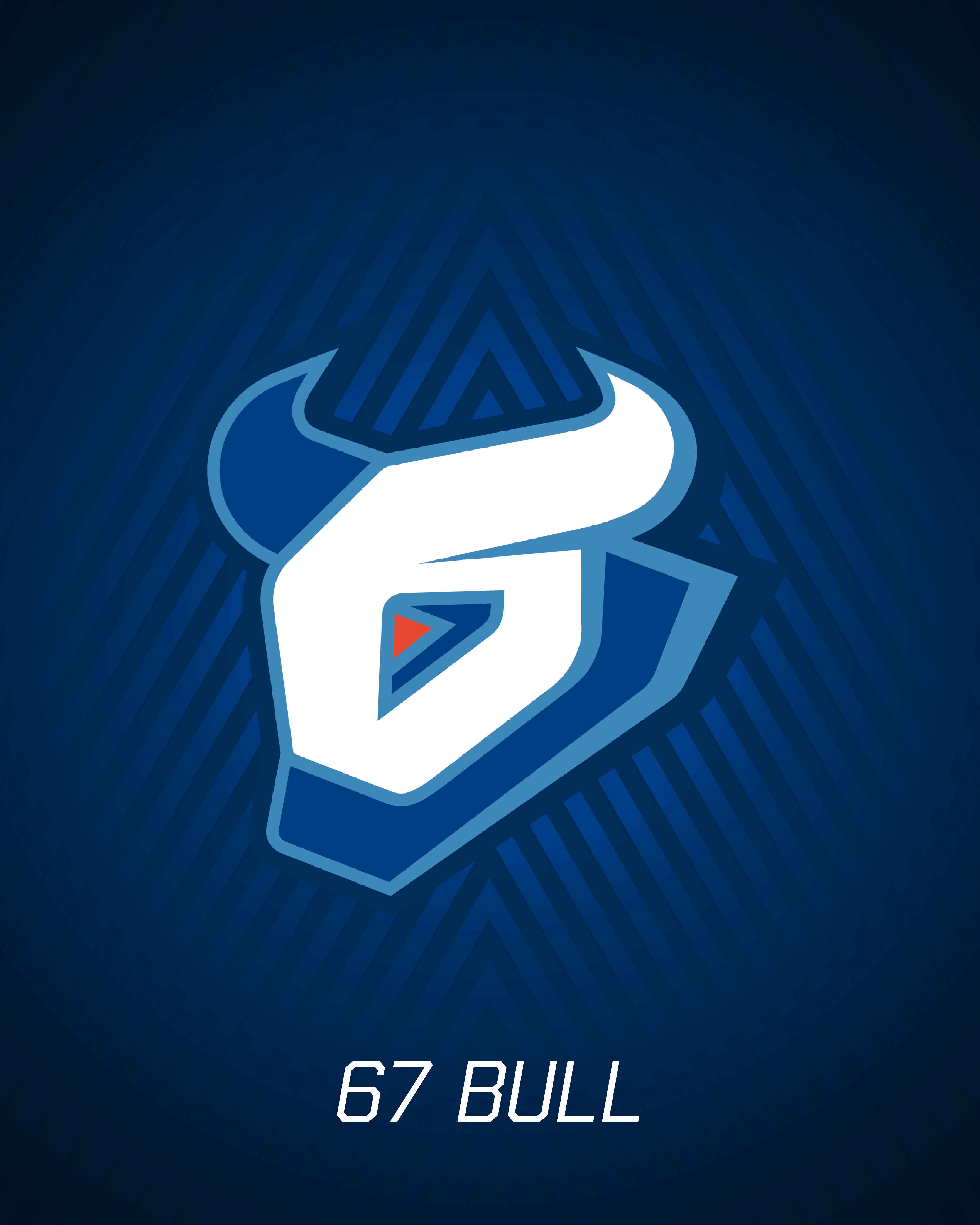
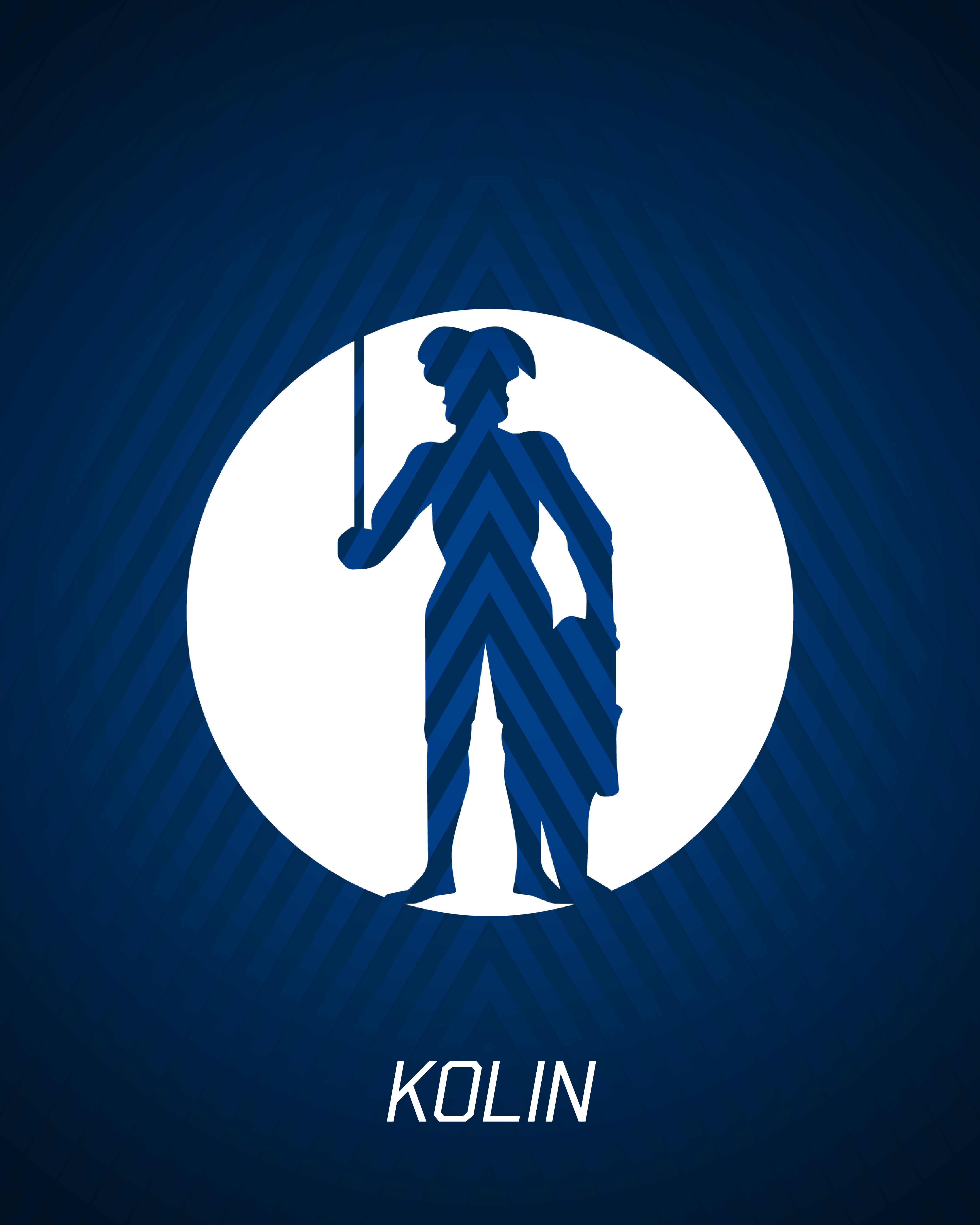
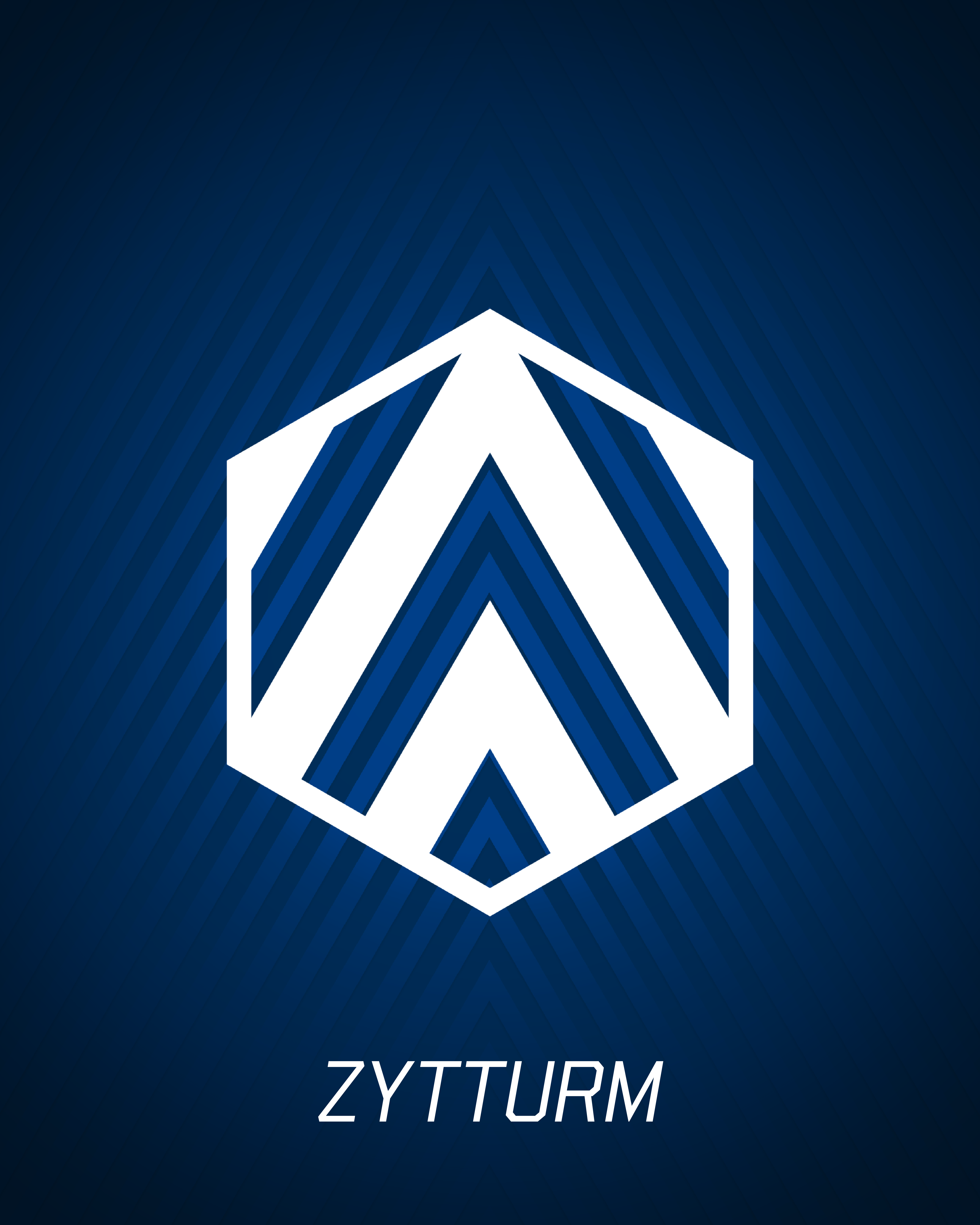
In addition to the main logo, six other icons representing the club’s history, the city and the region were also developed. The bull does not disappear either. In the “67 Bull Icon”, for example, it is associated with the founding year 1967.
With this new brand, the EVZ shows who it is – and where it wants to go. It is a symbol for further development, for cohesion and for the energy that has lived in this club since 1967. The three letters and the colours blue and white at the heart of the new brand identity carry this message far out into the region and into the EVZ family.
The EVZ will finish the current season in its “old” kit. The rebrand will take effect at the start of the 2026/27 season. Our men’s and women’s teams will start the championship in the 2026/27 season with the new logo on their chests – ready for a new era in blue and white.